THE GET ONLINE BLOG
What the heck is ‘above the fold’
No it's not a reference to my latest diet plan, it actually comes from the print industry (tabloid and broadsheet papers in particular).
You know how a film or TV series about the turn of last century will almost always feature a newspaper seller, normally with a faux cockney accent, selling papers on a street corner? Their papers are bundled and stacked ready to be purchased for a single coin by busy commuters rushing past. How do these commuters choose their paper? Quickly!
The papers are folded for convenience (easier to carry a folded paper than when unfolded) and the name of the paper and its main headline (and picture, if it's a fancy paper) are visible on top… above the fold of the paper.

Ahhhhh……..
In print design (in the days where papers were printed in extraordinary numbers) the above the fold section on the front page was the prime real estate. It made the difference between a good day of paper sales and a bad one (as did rain, but that's a different problem).
But wait… what does that have to do with a website?
Well in web design terms, the section of a homepage that is visible before any scrolling is the part that we consider to be ‘above the fold’ and therefore of maximum impact to the initial impression given to new visitors.
But wait…. doesn’t the position of that lower edge change depending on the device?
Oh you are a good student aren’t you? Yes it does. Well done and have a gold star!
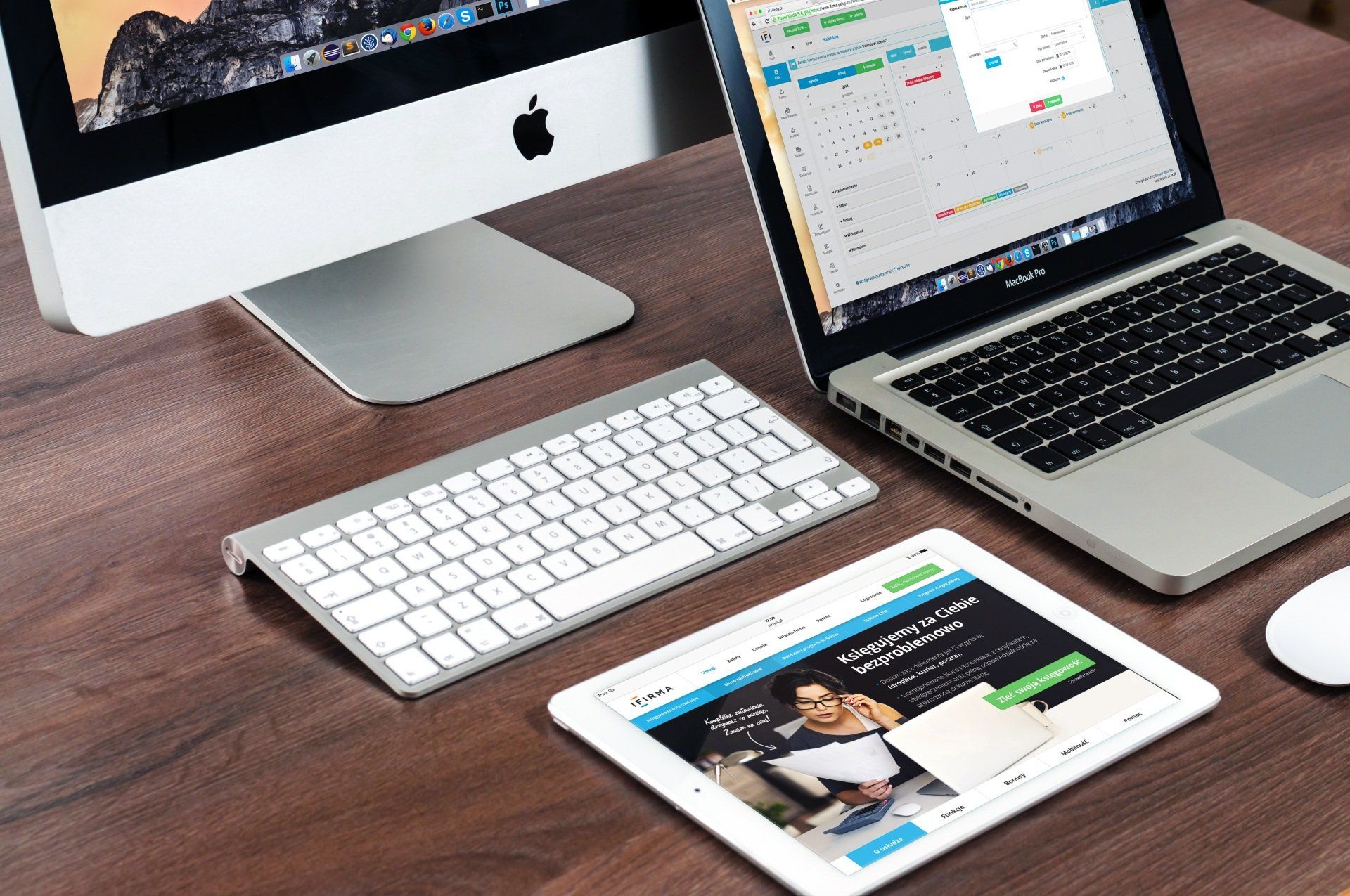
Whilst there are conventions of sizing, the number of variations of a screen size is actually quite large. So the bottom of the screen (the ‘fold’) can be anywhere across a wide range. Specifically, modern website design considers the different needs of different screen sizes
and orientations. A common approach is to consider: Desktop, Tablet, Mobile Landscape and Mobile Portrait (others are available). This is called Responsive Web Design.
So how on earth do we know what's ‘above the fold’ and what isn’t?
This is potentially quite tricky and the simple answer is that we need to focus less on the precision and more on the concept.
Whilst it is possible -
though with a great deal of effort and therefore potentially a great deal of extra cost - to design a website that measures the screen size of the visitor and lays out the content accordingly, this is an approach limited to only the biggest website designs (for the most part). The simple reason being that testing this approach exhaustively is a complex and never ending task.
A more practical approach is to use the basic 4 device sizes to give a good guideline of where everything should be.
But wait… surely smartphones are a nightmare to design for?
You are full of questions today aren’t you? Well yes and no. It's true that there are considerably more size and shape variations in smartphones than in Desktop or Laptop PCs. Practically speaking, we can’t accurately cater for all of them, so we shouldn’t.
We have the tools if we need them
Websites can be designed with screen size in mind, to a greater or lesser extent. We can apply rules that selectively target certain screen sizes. Practicality dictates that we keep it simple and design for 3 or 4 common sizes but thats enough to cover a lot of variation!
Like that pirate said, this is more a set of guidelines
Don’t fret over this topic but do use the concept to your advantage. It's a helpful guiding principle that will lead to a more effective way of handling new visitors to your home page.
So let's answer the question fully - why should you even care about Above the Fold?
Keeping this concept in mind helps you make better design choices for your website by making that first impression more impactful and concise. It will make it clearer to your visitors who you are, what you do and how to get in touch.
It makes for better websites.


